Meliph: A Standout Display Font for Digital Branding
It started with a hero section—just me, a half-finished boutique coaching site, and a headline that felt like it was whispering instead of commanding. I’d tried three clean sans serifs, two elegant serifs, and even a subtle script—but nothing gave the emotional lift I needed. Then I loaded Meliph. Instantly, the headline didn’t just sit on the screen—it leaned in, held space, and invited attention without shouting. That’s when I knew: this isn’t just another decorative font. It’s a visual anchor for digital presence.
What Makes Meliph Shine on Screen
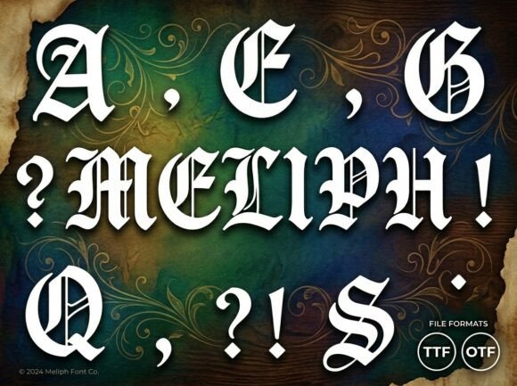
Meliph is a premium display font built for impact—not subtlety. Its letterforms carry confident rhythm and intentional asymmetry: soft curves meet sharp terminals, generous spacing breathes between characters, and subtle artistic flourishes (like the lifted crossbar on the lowercase e or the tapered tail on the y) add personality without sacrificing clarity. It’s not ornate to the point of distraction; it’s expressive with purpose. On a high-resolution desktop, Meliph feels rich and editorial. On mobile? With careful sizing and contrast, it holds its own—especially as a hero title or section header.
Real Layout Testing: Where It Works (and Where It Doesn’t)
I tested Meliph across six real web contexts: a portfolio homepage banner, a course sales page headline, a blog post intro line, a CTA button on a dark gradient, a welcome section over a muted lifestyle image, and a small brand tagline in the footer. Here’s what stood out:
- Hero sections & landing pages: Exceptional. At 48–64px on desktop (32–40px on mobile), Meliph creates instant hierarchy and emotional resonance—ideal for positioning a creative service or curated product.
- CTA buttons: Works best at medium sizes (20–24px) with ample padding. Avoid ultra-thin weights here—opt for the Regular or Bold if available.
- Image overlays: Pair with a subtle text shadow or semi-transparent background bar. Its open letterforms handle light/dark backgrounds well—but always test contrast ratios for accessibility compliance.
- Navigation & body copy: Not suitable. Meliph is a display font, not a workhorse. Use it for emphasis, not endurance.
- Small UI elements: Skip for form labels, breadcrumbs, or caption text under 14px. Detail can blur at tiny sizes, especially on lower-DPI screens.
Pairing It Thoughtfully in Web Design
Meliph thrives when grounded by intention. I paired it with Inter (a highly legible, variable sans serif) for all body copy, captions, and interface text—and the contrast elevated both fonts. The clean neutrality of Inter lets Meliph breathe and command focus where it matters most. For more editorial or luxury-leaning sites, I also tested pairing with EB Garamond: the gentle serif rhythm balanced Meliph’s modern flair beautifully in blog headers and quote callouts. Avoid pairing with other decorative or script fonts—Meliph doesn’t need competition. It needs context.
Performance, Licensing, and Practical Delivery
Before deploying, I checked what was included: WOFF2 and WOFF files (excellent for web performance), OpenType features like ligatures and stylistic alternates (which added nuance to repeated words like “the” or “and”), and full Latin multilingual support—including accented characters used across European languages. No surprises there. Licensing was clear: commercial use is covered for client websites, SaaS dashboards, and digital templates—as long as you’re not reselling the font files themselves. I uploaded it via @font-face with a fallback stack (font-family: "Meliph", system-ui, sans-serif;) and confirmed fast loading in Lighthouse. No render-blocking delays—even with the optional italic variant enabled.
When Meliph Strengthens Your Digital Identity
This font doesn’t just look good—it signals intention. On a coaching site, Meliph in the hero tells visitors, “This is thoughtful, human-centered work.” On a creative portfolio, it frames projects as curated experiences—not just deliverables. On a boutique online store, it makes product names feel like signatures rather than SKUs. That perceived quality lifts trust, supports brand consistency across pages, and quietly reinforces voice—whether your tone is warm and intuitive or bold and minimalist. It’s especially effective for audiences who value craft, authenticity, and visual storytelling: makers, educators, wellness practitioners, and independent creators building direct relationships online.
One caveat: Meliph earns its place through restraint. I found it most powerful when used in *one* high-impact spot per view—never stacked with multiple decorative fonts or overused across every heading level. Let it be the exclamation point—not the entire sentence. And always preview on real devices: a stunning desktop headline can tighten up unexpectedly on older iOS Safari unless line-height and letter-spacing are tuned.
If you’re choosing a display font to elevate your next digital project—not just decorate it—Meliph delivers with quiet confidence. It’s not flashy for flashiness’ sake. It’s designed to give your message weight, warmth, and unmistakable presence. And in a feed-saturated, scroll-happy world? That kind of clarity is rare—and worth every pixel.